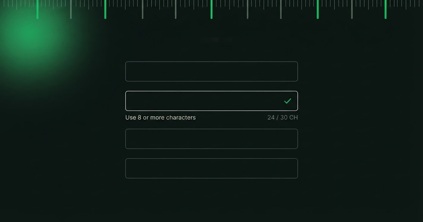
Forms are where users do work. Registration forms, checkout forms and settings pages all require effort from the user. Validation messages are the feedback system that tells users when that effort has gone wrong. And most validation copy is terrible.
"This field is required." "Invalid format." "Please check your input." These messages tell users they failed without telling them how to succeed.
Validation is one half of error copy. The other half, the failures that happen after a form is submitted, is covered in writing better error messages, with 48 generated examples across four scenarios.
Why Bad Validation Copy Is So Common
Validation messages are often written by developers, not writers. The technical constraint is easy to define ("must be 8 characters") but the human-friendly translation ("Your password needs at least 8 characters") requires a step that often doesn't happen in fast-moving product teams.
The fix is simple: treat every validation state as a copy problem, not a technical one.
The Anatomy of Good Validation Copy
Every validation message should answer two questions: 1. What did the user do wrong (or what's missing)? 2. What specifically should they do to fix it?
If your error message doesn't answer both questions, it isn't finished.
Before and After: Common Form Fields
Email address
Password
Phone number
Credit card
Date fields
Timing Matters: When to Show Validation
There are three moments to show validation feedback: 1. On blur (when the user leaves the field), ideal for most fields 2. On submit (when the user submits the form), only for mandatory fields the user skipped 3. Real-time (as the user types), only for format-sensitive fields like passwords and phone numbers
Showing errors while the user is still typing is distracting and often premature. Wait until they've finished with a field before flagging it.
Inline Help vs Error Messages
Not all validation copy should be reactive (appearing after an error). Some should be proactive, appearing before the user has a chance to make a mistake.
Inline help text (shown below a field before submission) can preempt errors entirely:
- Password field: "Must be at least 8 characters and include a number."
- Username field: "3 to 20 characters, letters and numbers only."
- Date field: "Format: DD/MM/YYYY"
When inline help is present and the user still hits an error, the error message should be different from the help text. The help text told them what to do. The error message should acknowledge that they tried and specify what still needs fixing.
Accessibility Considerations
Validation messages must be accessible, not just readable: - Use aria-describedby to associate error messages with their fields - Don't rely on colour alone to indicate errors (add an icon or text prefix) - Ensure screen readers announce validation errors when they appear - Use role="alert" for error messages that appear dynamically
Good validation copy that isn't accessible is still a failure. Both dimensions matter.
The "Blame" Problem
A subtle but important principle: validation messages should never feel like accusations. "You entered an invalid email" shifts the blame onto the user. "This doesn't look like a valid email" is neutral and almost treats it as an observation rather than a verdict.
The difference is small. The user response is not. Keep your validation copy neutral, specific, and constructive, and you'll see form completion rates improve measurably.
We build the copy layer for product screens: tone presets, character ceilings and a review trail that travels with every string.