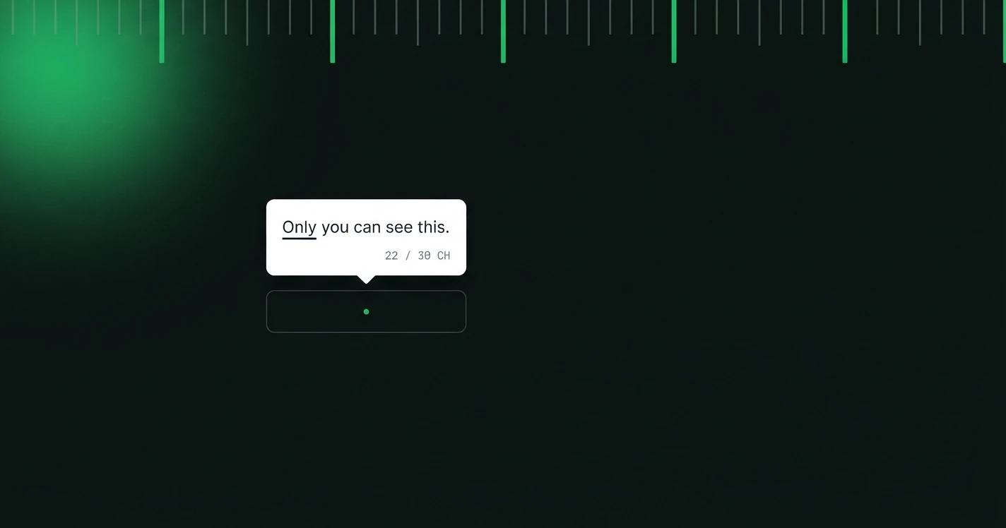
Tooltips are the most passive form of in-product communication. They only appear when a user hovers or taps, which means the user is already curious. They've asked the implicit question "what does this do?" Your tooltip has one job: answer that question, clearly, in as few words as possible.
That sounds simple. It rarely is.
The Problem with Most Tooltips
Most tooltip copy falls into one of three failure modes:
1. Restating the label. A button labelled "Archive" with a tooltip that says "Archive this item" tells the user nothing new. If the label is already clear, no tooltip is needed.
2. Being technical instead of helpful. "Triggers an asynchronous background process to compress and move the file." What does this mean to the user? Nothing actionable.
3. Being so short it's useless. "Saves your work." When? As a draft? Permanently? With what settings?
What Good Tooltip Copy Does
Good tooltips do one or more of the following: 1. Explain what a control does that isn't obvious from its label 2. Show the output or result of an action 3. Give a keyboard shortcut or power-user tip 4. Reassure the user about a potentially risky action
Length and Format
Tooltips should be 1 to 2 sentences maximum. If your tooltip needs three sentences, the UI has a discoverability problem that copy alone can't solve.
Rules: - End with a period (it signals a complete thought) - No exclamation marks (they feel incongruous in a tooltip) - No markdown or rich text: plain prose only - Don't start with "This button…" or "Click here to…". Start with the action or outcome
When Not to Use a Tooltip
Not everything needs a tooltip. Use them for: - Icon-only buttons with no visible label - Controls with non-obvious side effects - Fields where format matters (e.g. a date field expecting a specific format) - Features where the benefit isn't clear from the UI alone
Skip tooltips for: - Standard UI patterns users already know (save, undo, bold) - Things already explained in nearby label or helper text - Anything a new user would understand in context
Overusing tooltips is a symptom of a UI that relies too heavily on explanation rather than design. If you're adding tooltips to half the controls on a screen, reconsider the controls first.
Tone Considerations
Tooltips should match your product's voice but skew functional. Even playful brands write neutral tooltips. This is not the place for personality. Users are in "what does this do?" mode, not "entertain me" mode.
The exception: celebrating power-user features. A tooltip that says "Pro tip: use ⌘K to open this from anywhere" earns its charm because it gives something, not just explains something.
Accessibility
Tooltips that appear only on hover are inaccessible to keyboard and touch users. Best practices: - All tooltip content should also be available as an aria-label on the trigger element - Tooltips should be triggerable via keyboard focus, not hover alone - Don't put interactive elements (links, buttons) inside tooltips. They're hard to reach - Don't rely on tooltip content for essential task completion. It may not be discoverable
If the information in a tooltip is critical for completing a task, it belongs in the UI itself, not in a tooltip.
The Pre-Publish Checklist
Before publishing any tooltip, ask: - Does this add something the label doesn't already communicate? - Is it under 25 words? - Does it start with an action verb or the outcome? - Does it match the tone of surrounding UI copy? - Have I tested it on keyboard and touch?
Good tooltips are invisible in the best sense: users find what they needed and move on without thinking about the words. That's the goal.
We build the copy layer for product screens: tone presets, character ceilings and a review trail that travels with every string.