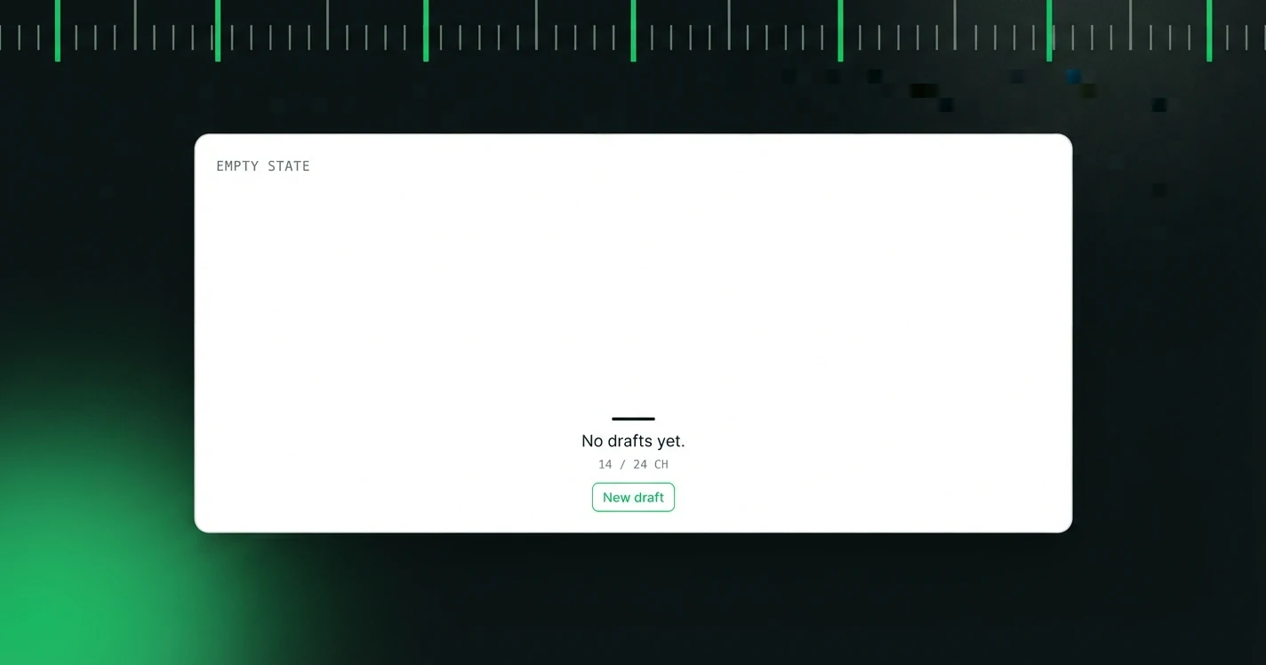
Empty states are screens that appear when there's no data to show yet: an empty inbox, a new project with no screens, a library with no saved copy. Most products treat them as an afterthought: a generic illustration and the words "Nothing here yet."
That's a missed opportunity. Empty states appear at the exact moment when a new user is most impressionable and most uncertain about what to do next.
Why Empty States Are High-Stakes
Consider the journey of a new user. They've signed up, they've gone through onboarding, and now they're looking at their first real screen in the product, and it's empty. This is a moment of potential drop-off. The user is asking: "What do I do now? Was this worth signing up for?"
A well-written empty state answers both questions.
The Three-Part Empty State
The best empty state copy has three parts:
- Acknowledge the state: briefly name what's empty and why
- Paint a picture: show the user what this screen looks like when it's full (a peek into their future)
- Give a clear first action: one CTA, not three
Example for an empty project library:
"Your library is empty for now. Once you start generating copy, your saved strings will appear here, searchable, tagged, and ready to export.
[Generate your first copy →]"
Before and After: Real Empty States
Projects page
Library
Search results
The Tone of Empty States
Empty states should feel like a knowledgeable colleague nudging you in the right direction, not a system message telling you that you've failed to have data. Avoid negativity ("nothing," "no results," "failed to load") unless you're replacing it with something constructive.
What to Avoid
- Illustrations without context: a floating robot or a sad box means nothing without words that tell the user what to do
- Multiple CTAs: pick one action and make it obvious
- Technical language: "No records found in this collection" is a database message, not a product message
- Filler phrases: "Looks like there's nothing here!" adds no information
The Metric to Watch
The best proxy for empty state copy quality is the percentage of new users who complete a first action from the empty state screen, without navigating away. If users are bouncing from empty states, the copy isn't doing its job.
We build the copy layer for product screens: tone presets, character ceilings and a review trail that travels with every string.