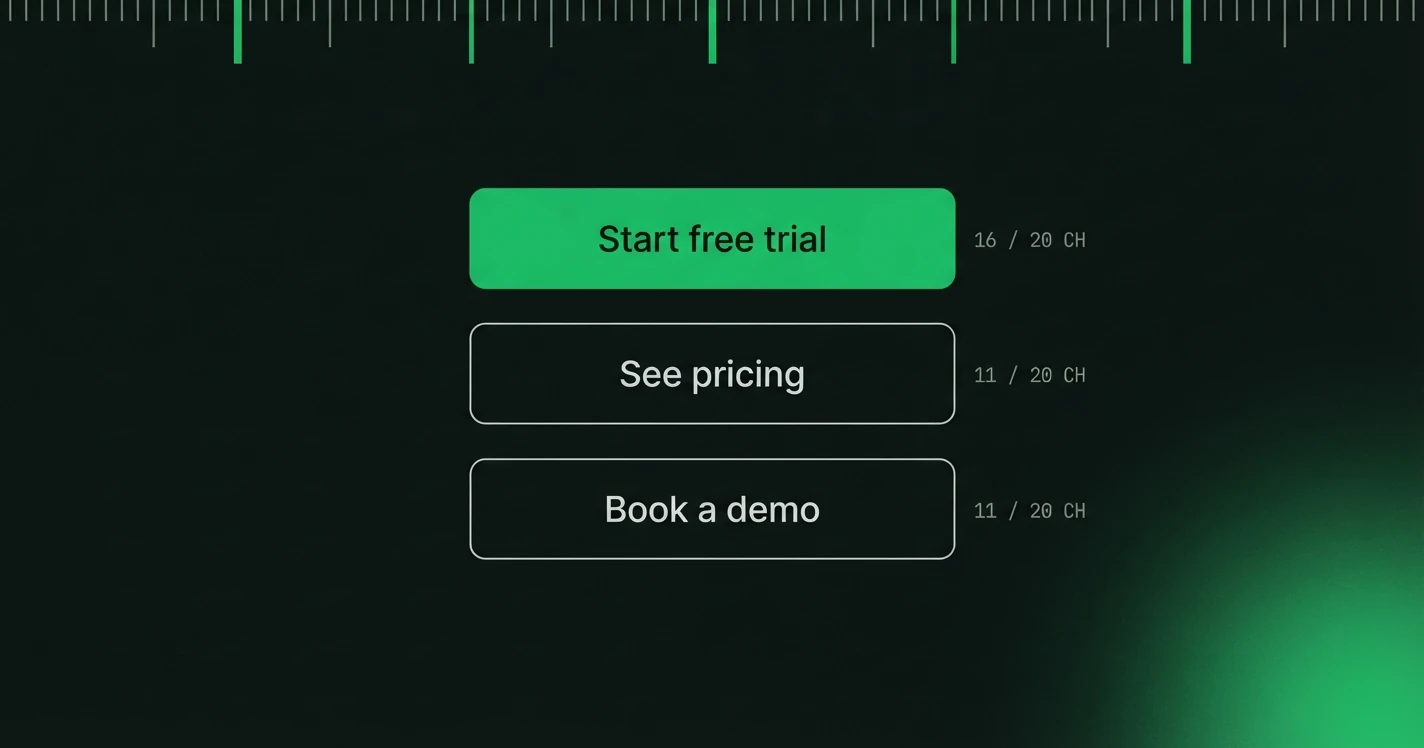
The words on your buttons matter more than almost any other text on your page. They're the last thing a user reads before deciding whether to act. And yet most products default to "Submit," "Continue," or "OK", words that communicate nothing about what happens next.
Why Button Copy Matters
Specific, benefit-driven button copy beats a generic verb for a reason you can reason your way to without a study. "Submit" tells the user nothing about what happens next, so they have to guess, and guessing is friction. "Get my free report" removes the guess. The user knows what they are getting before they commit to it.
The CTA Formula
The most effective CTAs follow a simple pattern:
[Action verb] + [Specific outcome or object]
- "Start free trial" → better than "Get started"
- "Download the guide" → better than "Download"
- "Unlock team features" → better than "Upgrade"
- "Save my changes" → better than "Save"
The more specific the outcome, the lower the perceived risk of clicking. Buttons are one of seven microcopy types covered in our guide on how to write microcopy in UI, if you want to see the same treatment applied across errors, empty states and the rest.
CTAs by Context
Sign-up and registration
Avoid: "Create account," "Register," "Sign up" Try: "Start for free," "Create my free account," "Get started free"
The word "free" is the most powerful modifier in signup flows. If your product has a free tier, say so in the button.
Checkout and payment
Avoid: "Place order," "Submit payment," "Confirm" Try: "Pay ₹1,299 now," "Complete purchase," "Confirm & pay"
Include the price in the button when possible. It sounds counterintuitive, but it actually increases conversion. Users who see the price in the CTA have already mentally accepted it.
Upgrade and upsell
Avoid: "Upgrade," "Go Pro," "Buy plan" Try: "Unlock unlimited projects," "Get team collaboration," "Remove the limit"
Frame upgrades around what the user gains, not what they're paying for. Lead with the benefit.
Destructive actions
Avoid: "Delete," "Remove," "Yes" Try: "Delete this project," "Yes, cancel my subscription," "Remove permanently"
Destructive actions should name exactly what's being destroyed. It makes users slow down and confirm their intent, reducing accidental deletions.
Form submissions
Avoid: "Submit," "Send," "OK" Try: "Send my message," "Request a demo," "Get my results"
"Submit" is the laziest word in UI. It tells the user nothing about what happens next. Replace it every time.
The "My" vs "Your" Debate
The best-known data point here is a 2013 test by Michael Aagaard at ContentVerve, which swapped "your" for "my" on a single button and recorded a large lift in clicks. The usual explanation is ownership: "Start my free trial" is the user's own words, "Start your free trial" is the product talking at them.
Worth knowing, but it is one test on one page from over a decade ago, not a law. Treat first-person as a reasonable default and test both on your own button.
Length and Placement
- Primary CTAs: 2 to 5 words maximum
- Secondary CTAs: Can be slightly longer if they need qualification ("No thanks, I'll stay on the free plan")
- Never use two primary CTAs of equal visual weight on the same screen. One must be clearly dominant
The One Question to Ask
Before finalising any CTA, ask: "What does the user think will happen when they click this?" If there's any ambiguity between what the button says and what actually happens, rewrite the button copy.
We build the copy layer for product screens: tone presets, character ceilings and a review trail that travels with every string.